
Sidefolio Portfolio Template - Grid-Based, Clean & Creative
Creative & Freelancer
Overview
The Sidefolio theme is a refined, vertically-oriented portfolio designed for creatives, freelancers, and designers who want a clean, content-first presentation. Built around a fixed side navigation ruler and spacious content blocks, it replaces cluttered multi-column grids with a beautifully paced single-column reading experience.
Every section animates smoothly into view on scroll, and the hero showcases your top projects in a stacked card fan that immediately captures attention. It strikes the perfect balance between editorial minimalism and interactive polish.
Design Philosophy
Sidefolio is built on the principle that great portfolios let the work speak for itself. The layout is deliberately spacious and distraction-free, employing refined typographic choices and subtle interactive embellishments:
- Fixed Side Navigation Ruler: A vertical ruler with tick marks and labeled sections sits fixed to the left viewport edge, providing spatial orientation without consuming content width.
- Animated Card Showcase: The hero area renders your top three projects as overlapping, rotated cards with staggered entrance animations, creating an immediately engaging visual statement.
- Live Clock & EST Badge: A live-updating clock and establishment year badge in the hero topbar add a refined, editorial-magazine touch to the opening section.
- Company Logo Badges: Work experience entries display employer names as inline pill badges with dynamic styling, making career timelines instantly scannable.
Key Features
Fixed Side Navigation
A vertical ruler with tick marks and hover-activated labels follows your scroll, providing instant spatial orientation across all sections.
Animated Hero Showcase
Your top 3 projects fan out as overlapping, rotated cards with staggered spring-physics entrance animations.
Built-in Contact Form
A full-featured contact form with a resizable textarea and mailto integration, ready for visitor inquiries.
Smooth Scroll (Lenis)
Hardware-accelerated smooth scrolling via Lenis provides a premium, buttery navigation feel across the entire page.
Tip
The side navigation ruler automatically hides empty resume sections. If your resume doesn't have Education or Publications data, those nav entries won't appear - keeping the experience clean and relevant.
Sections Breakdown
All resume sections are rendered inside spacious, animated content blocks that fade in on scroll with staggered timing. The layout adapts between mobile and desktop while maintaining consistent visual language.
Hero & Project Showcase
The hero section opens with an avatar, a bold two-line greeting ("Hey, I'm [Name] / [Role]"), a short bio pulled from your resume narrative, and twin CTA buttons ("View - projects" and "Discuss your ideas"). Below the fold, your top three projects are displayed as overlapping, rotated cards that animate in with spring physics.
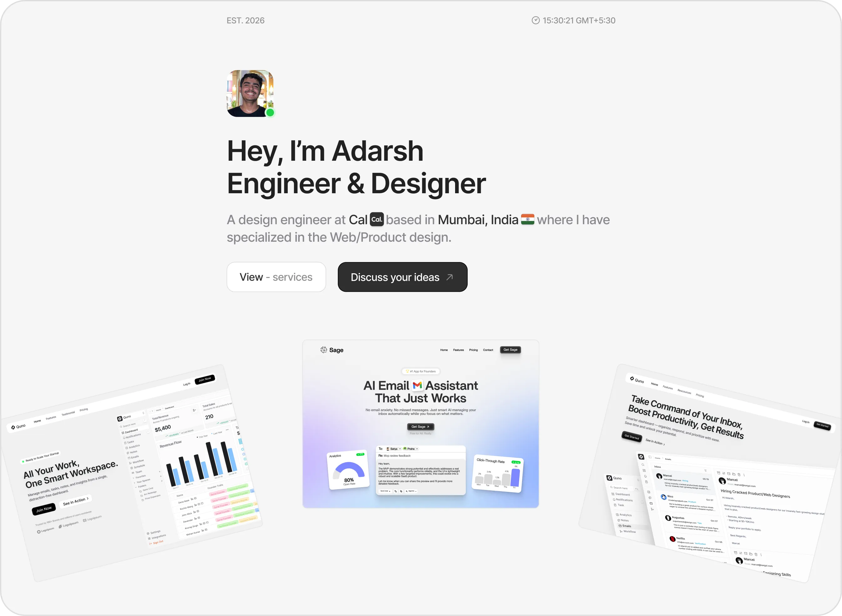
The Sidefolio hero section featuring avatar, two-line greeting, bio excerpt, CTA buttons, and a fanned three-card project showcase.
Work Experience & Company Badges
Work experience entries display date ranges in a muted left column alongside bold job titles and inline company badges. Each role's responsibilities are listed with custom pointer icons, creating a clean, scannable timeline layout.
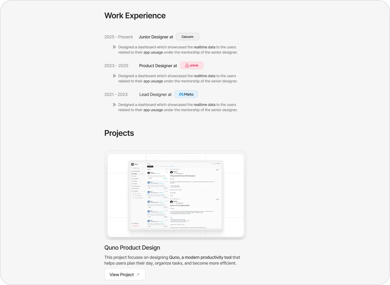
Work experience timeline with inline company badges and responsibility bullets, followed by project cards with image previews.
Skills Grid & Contact Form
Technical skills are organized into categorized cards with inline tag badges. The contact section features a clean, full-width form with name, email, and a resizable message textarea - all wired to a mailto link for instant email delivery.
Dynamic Theme Customization
The Sidefolio theme exposes a focused set of toggle-based controls via the ThemeEditor sidebar, keeping customization simple and purposeful:
| Configuration Key | Visual Effect | Customizable Options |
|---|---|---|
| showSideNav | Toggles the fixed left-side vertical navigation ruler. | True (Visible) | False (Hidden) |
| showTopbar | Toggles the hero topbar displaying EST. year and live clock. | True (Visible) | False (Hidden) |
| showHeroShowcase | Toggles the fanned 3-card project showcase in the hero. | True (Visible) | False (Hidden) |
| showContactForm | Toggles the full contact form section at the bottom. | True (Visible) | False (Hidden) |
| color | Sets the primary accent color for buttons and focus states. | 16 color presets or custom hex values |
| fontId | Alters the typography pairing across headings and content. | Geist, Inter, Outfit, DM Sans, Plus Jakarta Sans |
| borderRadius | Determines corner rounding for cards, buttons, and inputs. | sharp (flat) | rounded (smooth) | pill (capsule) |
| spacing | Adjusts vertical padding between content sections. | compact | default | relaxed |
Explore more themes
View all →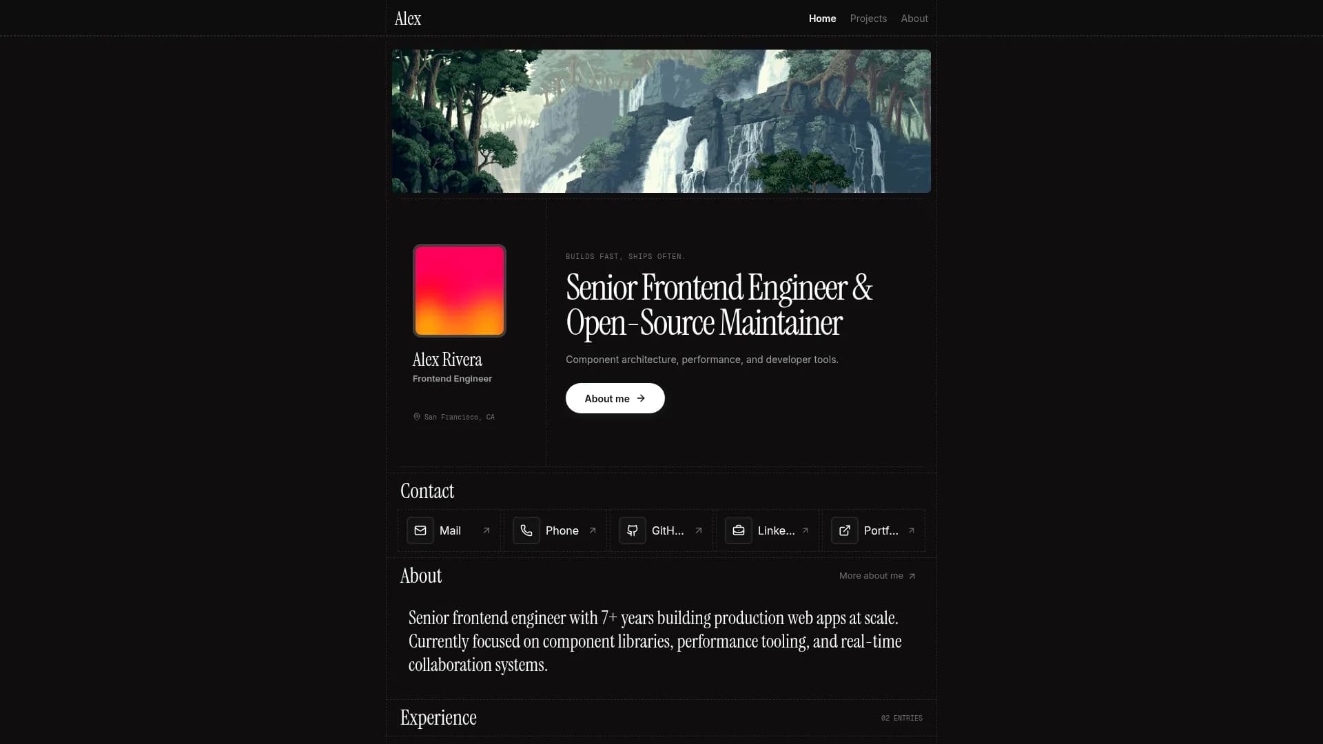

Margin
Editorial & Technical
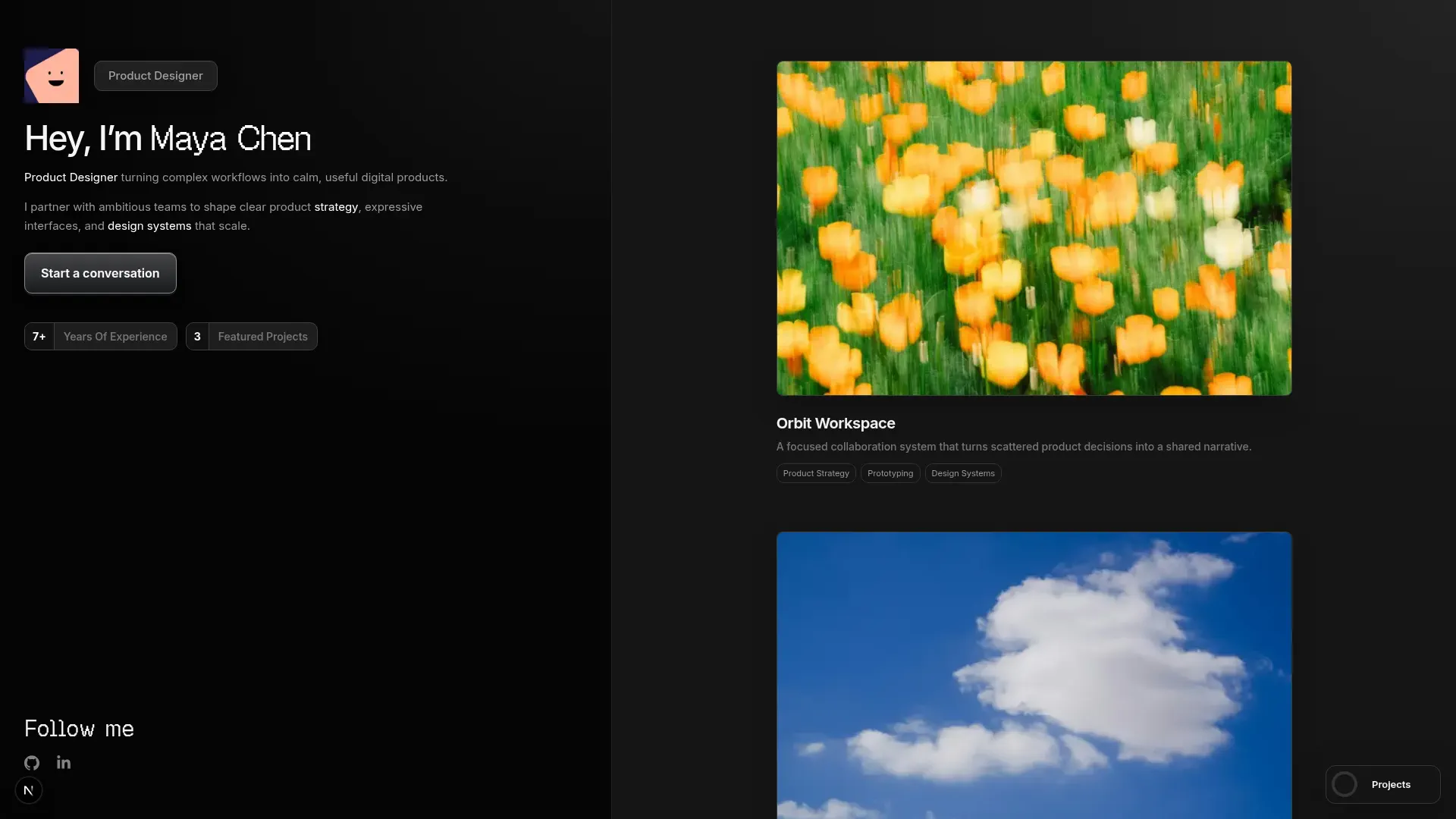

Left Anchor
Anchored & Immersive
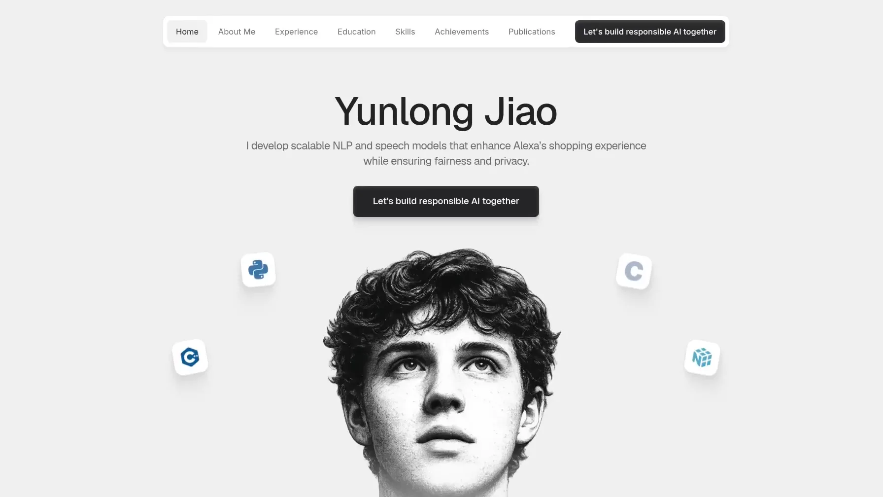

Persona
Refined & Personal
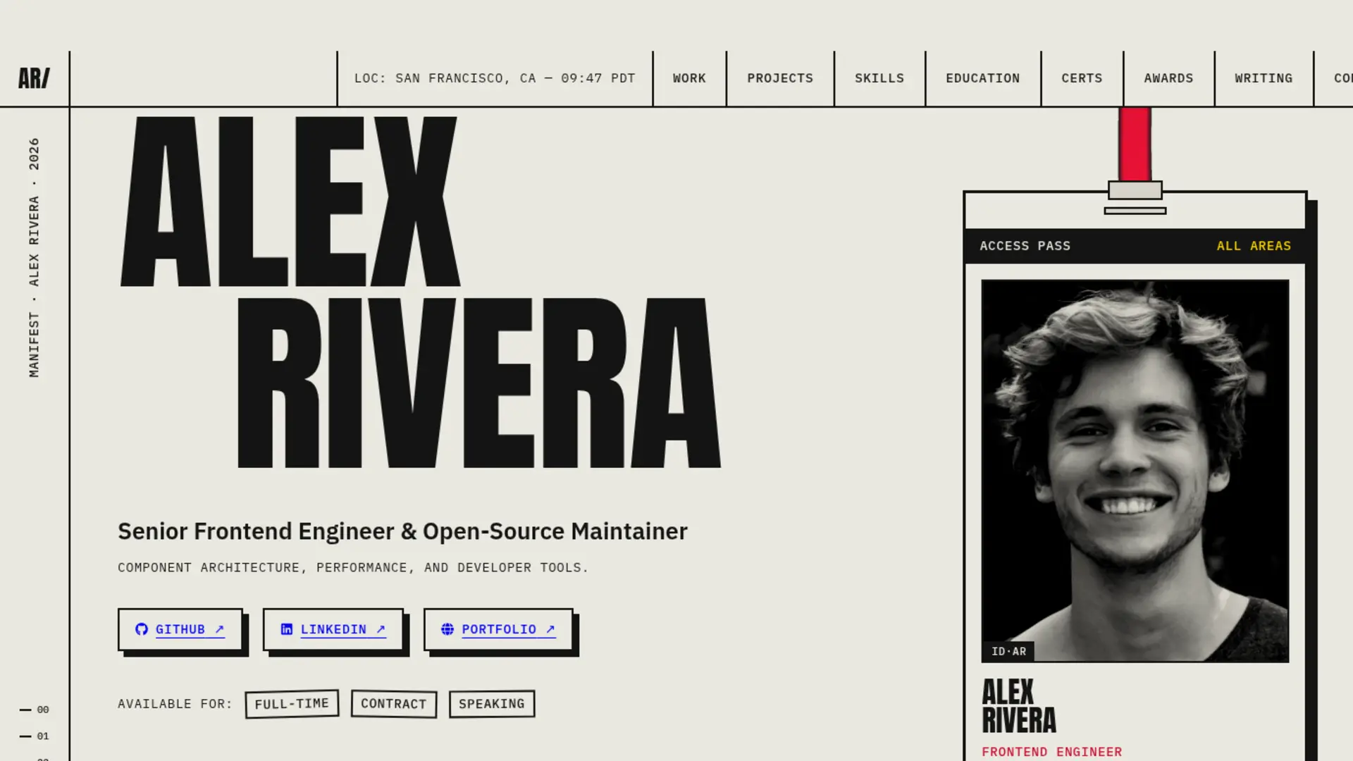

Brutalism
Raw & Industrial
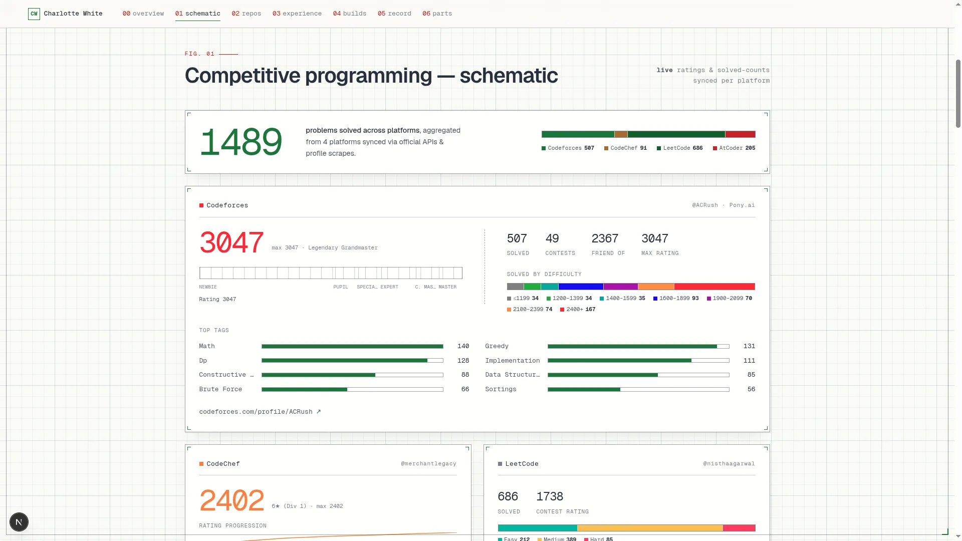

Blueprint
Coding & Competitive
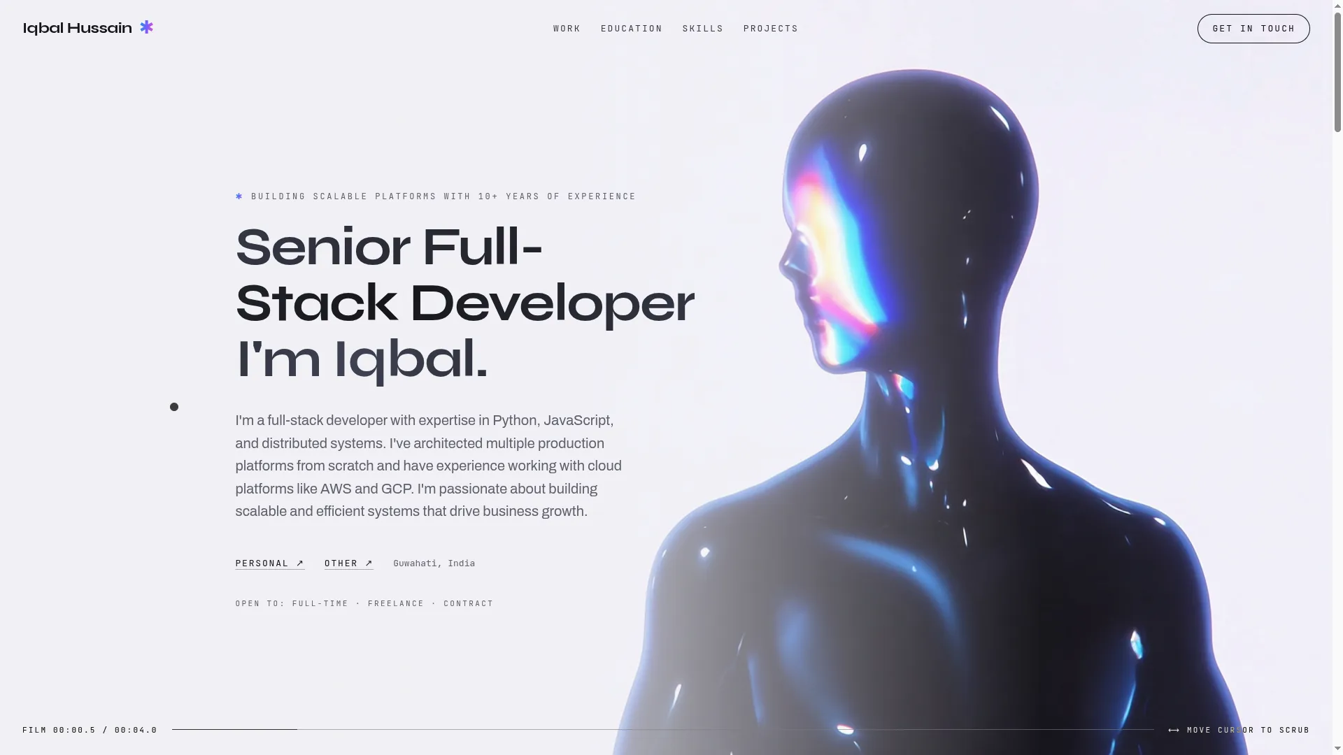

Mainframe
Cinematic & Editorial
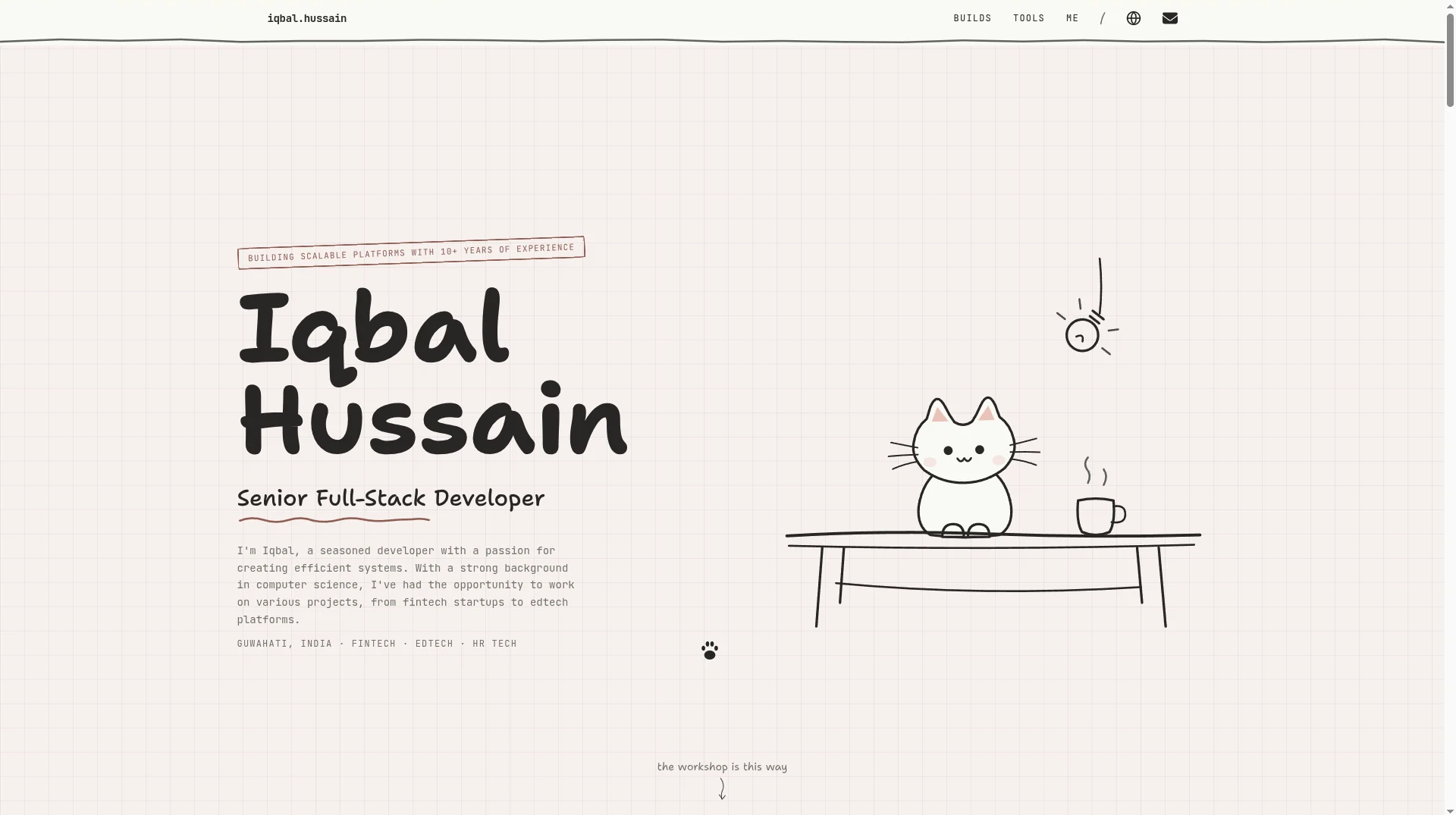

Workshop
Hand-drawn & Playful
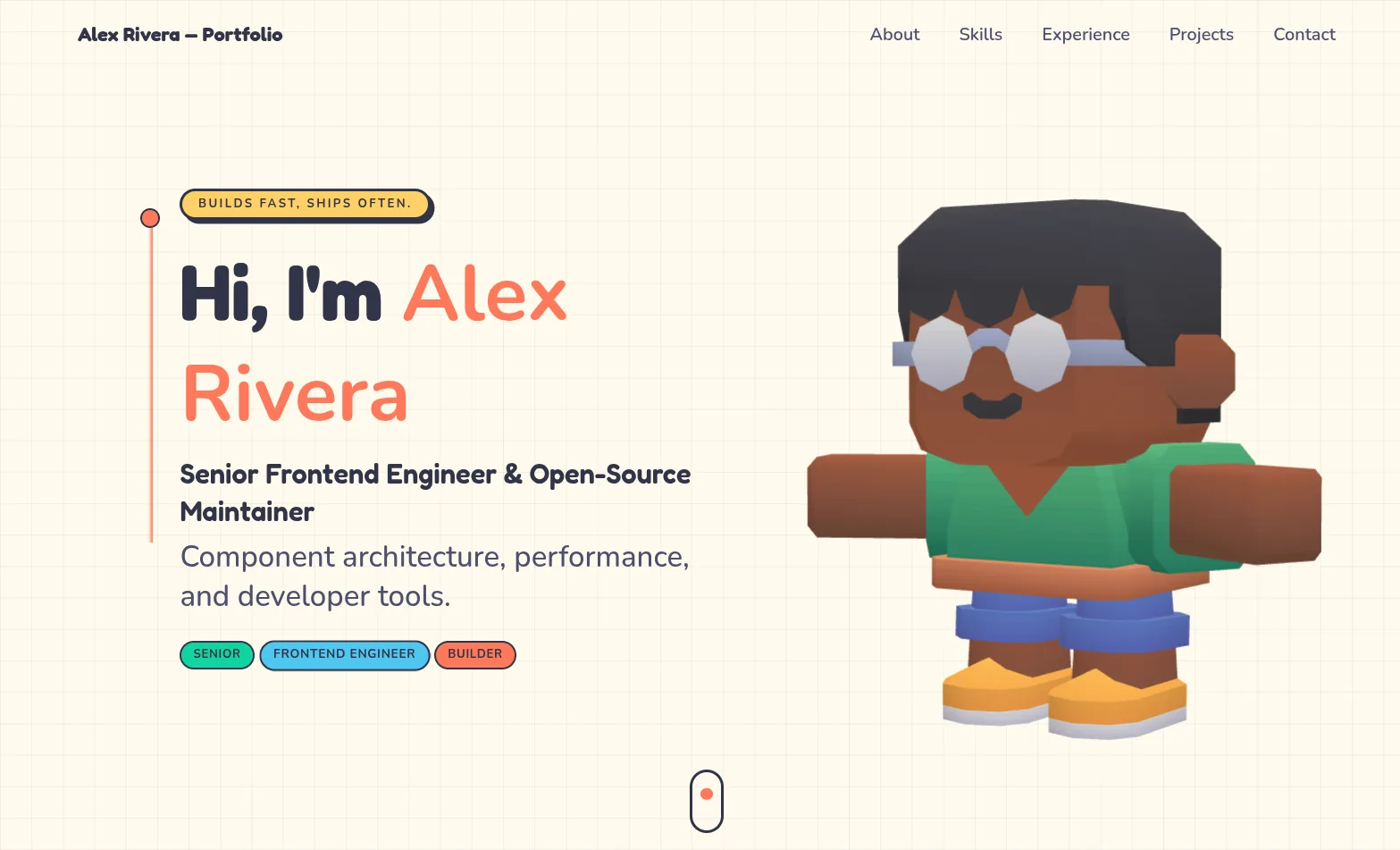

3D Studio
Interactive & Immersive
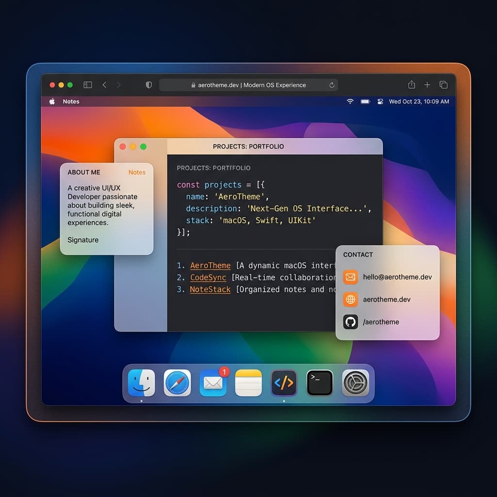

macOS Sequoia
Classic OS Simulator
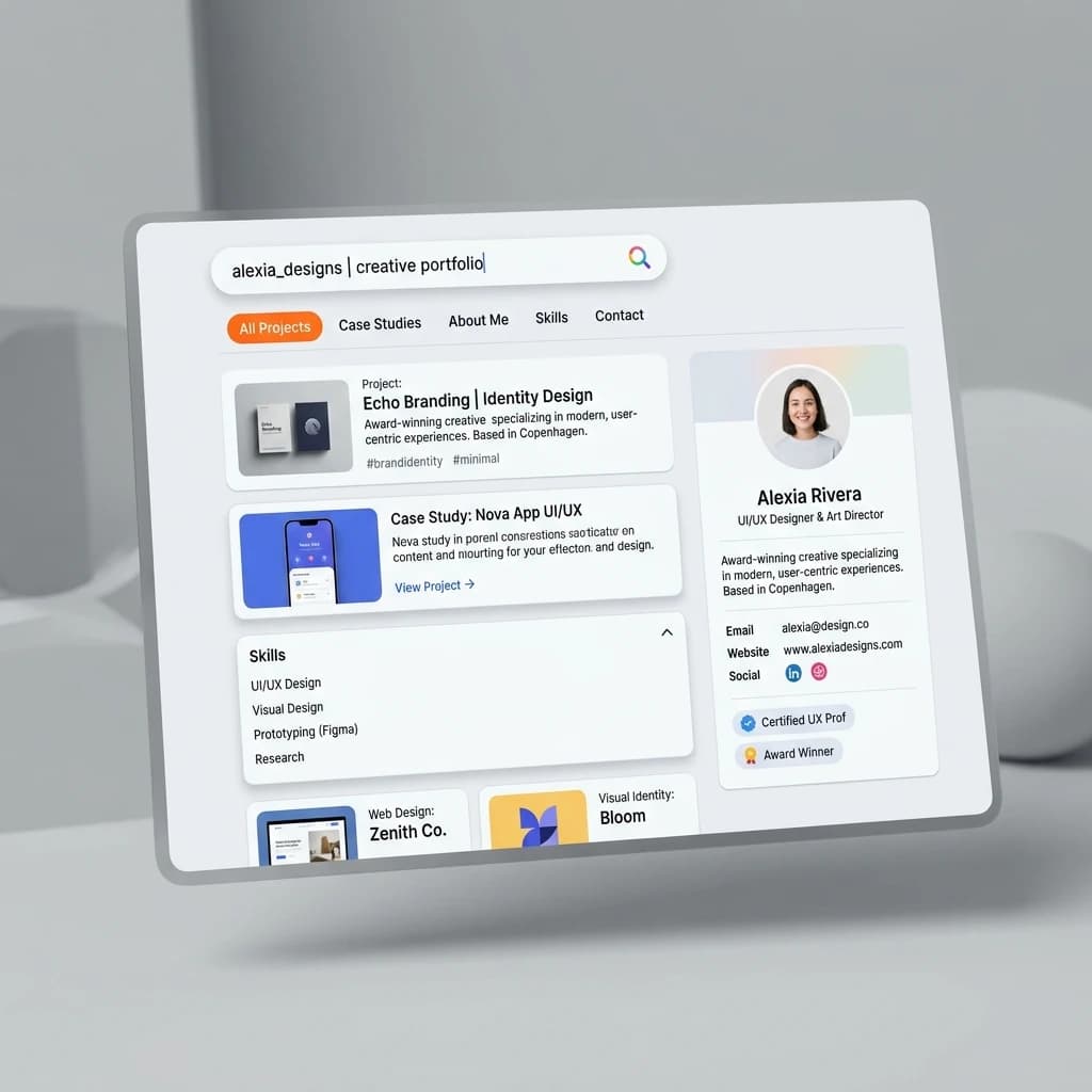

Google Search
SEO & Search Engine replica


Modern
Designer & Developer
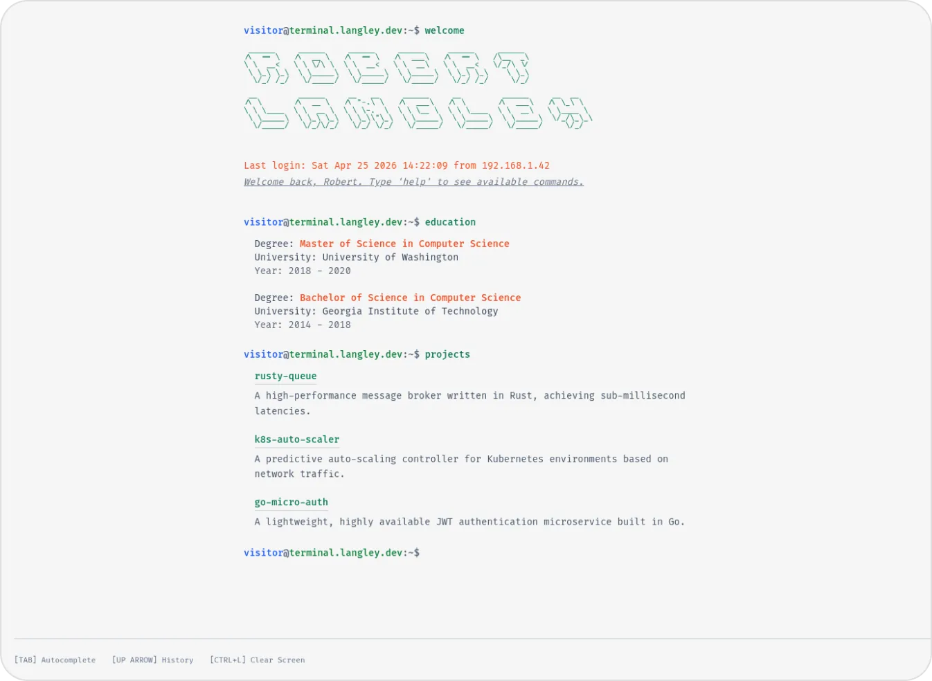

Terminal
Developer & Engineer
Margin
Editorial & Technical
Left Anchor
Anchored & Immersive
Persona
Refined & Personal
Brutalism
Raw & Industrial
Blueprint
Coding & Competitive
Mainframe
Cinematic & Editorial
Workshop
Hand-drawn & Playful
3D Studio
Interactive & Immersive
macOS Sequoia
Classic OS Simulator
Google Search
SEO & Search Engine replica
Modern
Designer & Developer
Terminal
Developer & Engineer